Physical Aspects
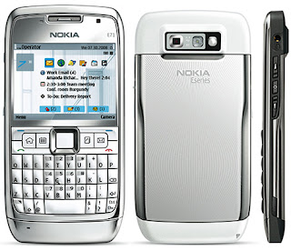
The E71 is a very solidly built smartphone. Its body is largely made up of strong metal panels, and its solid 129g (4.5oz) weight inspires a lot of confidence, even if it is a fair bit heavier than some competing models. In spite of its weight, though, the E71 is very compact. It measures only 115mm x 57mm x 11mm (4.5" x 2.2" x .4") in size. That's a hair longer, but a few millimeters narrower and 1mm thinner than Samsung's svelte BlackJack II.
The front of the E71 consists of two main features, the 2.4" QVGA resolution display and the QWERTY keyboard and associated navigation buttons. The display is a bit small for my liking, but if the display had been any larger then the entire device would have grown in size and E71 would lose some of its pocketability. The display is reasonably bright and colorful, and the automatic backlight adjustment setting manages the screen's battery drain pretty nicely.
The full QWERTY keyboard on the E71 is pretty good, though I prefer the spaced out keys on the BlackJack II for the confidence they inspire. Admittedly, the E71's keyboard is much better looking due to the fact that the keys fit snugly together and, instead of spacing, rely on a domed shape to guide fingertips. The keyboard is somewhat cramped, but I have managed to adjust to it pretty well in spite of having large hands. Most women would probably find the keyboard spot on. The control and shortcut cluster above the keyboard is also a bit cramped, but they do provide the user with a lot of flexibility. The chrome d-pad controller is good enough for general use, and the softkeys and call keys are wide, even if they are quite narrow. The dedicated home, calendar, contacts, and mail buttons are very handy, and can be reprogrammed for both short presses and long presses, which gives the user a lot of customization options.
There are few other controls on the E71. On the left edge you'll find the covered microSD slot and micro-USB port (data only, not power), and on the right edge you'll see the two volume buttons that straddle the voice dial button (activated with a long press). There is no dedicated shutter button on the E71, in spite of the fact that it sports an autofocus 3.2 megapixel camera. I like the spring loaded back cover release buttons that are located on the bottom of each side of the phone. They require a bit of strength to depress, but they make for a very solid rear cover fit.
A 2.5mm headset jack sits above the volume controls, and the camera lens and flash can be found around back. The only other features of note on the E71 are the mini Nokia power port on the bottom of the phone and the red power button and speaker grille on the top. The power button looks nice, but is a bit hard to use, especially when compared with the similarly red button on the E66.
Overall we are very impressed by the design of the Nokia E71. That missing camera button and the glossy metal finish of the phone, which makes an oily looking mess of the most innocent of fingerprints, are the only real downsides to the E71's otherwise fine physical design. The E71 comes with a nice carrying case (and matching lanyard) that will help keep the finish clean, though.


1 comments:
It's a cool phone. My friends got it and after testing it out, it seems really nice. Love the build quality and using the keyboard is really nice.
I'm used to a touchscreen phone, so I'm not into this type of phone yet...
Post a Comment